


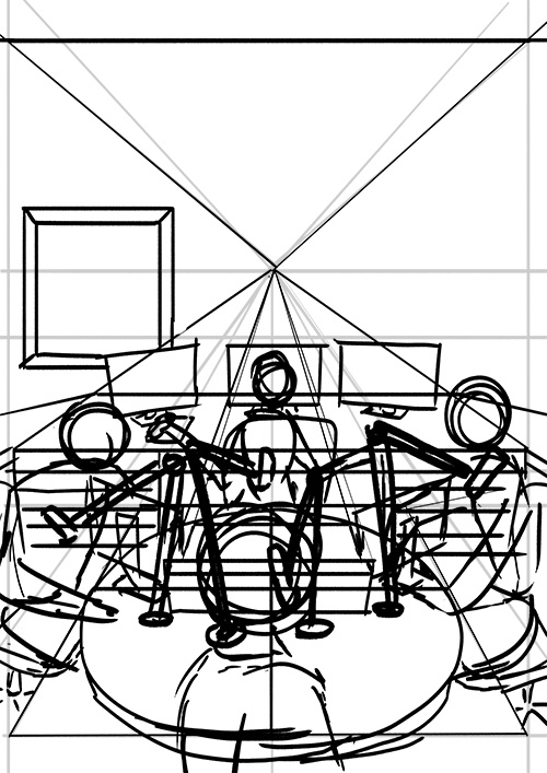
One of the most important parts of the job is thumbnailing! Here I decided what should be included on the page to get the story across clearly. Composition is planned out at this stage. These thumbnails are actual size. I like to work very small, if it's legible at this scale, it will be in print. I was looking for a powerful downshot of all characters in the comic with a detailed radio studio. My first attempt included everything needed to tell the story, but I felt it needed more of a center-outside flow, natural, so that your eye seeks out that kind of movement. It creates a more comfortable, immediate movement.
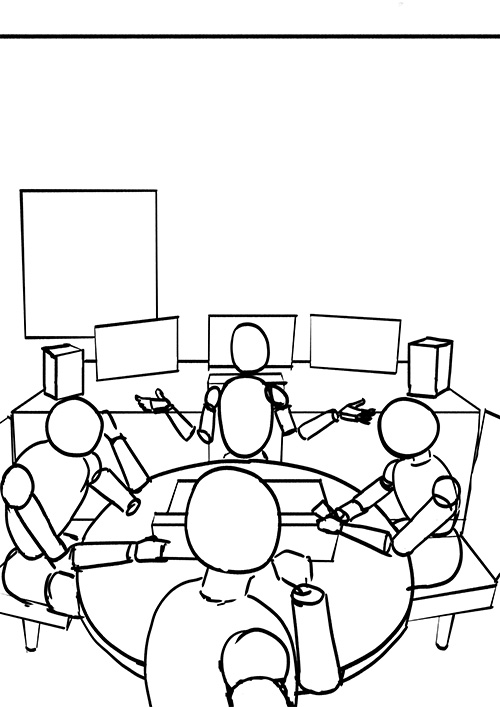
Now, moving on to the actual page. Layouts serve as the foundation where I arrange all my basic shapes. At this stage, I focus on proportions and overall structure—no details yet! Getting absorbed in drawing small, enjoyable sections is tempting, but proper planning from the start is essential. Without it, you often end up making major revisions and excessive erasing. If you are not drawing digitally, here is a quick note on tools: I use a mechanical drafting pencil with 2H lead, a magic rub, an electric eraser, and a selection of ruling triangles and circle templates.
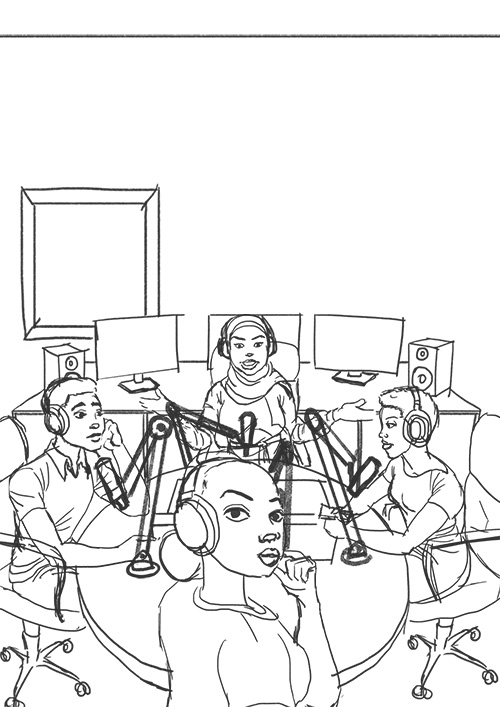
The key here is to keep things loose! I start by sketching the basic anatomy, roughing in the costume design, and—though not shown here—setting up my perspective grid. I make sure to keep my pencil lines very light since most of them won’t appear in the final version.
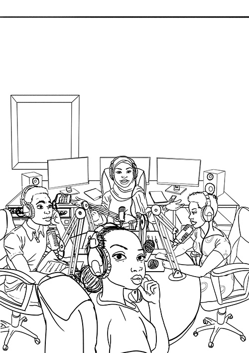
At this stage, I have completed my line work. I carefully go through the rough sketches from the previous step, selecting the lines that work best while ensuring that the costume, props (such as Kadzo), and environment are fully designed and included on the page. For me, this is the most time-consuming part of the process. By establishing all the exterior line art first, I minimize the need to backtrack. Mistakes can be a major obstacle when working under tight deadlines!
This step can be done manually with quality ink and a brush or digitally using a graphic tablet and photo editing software like Photoshop.
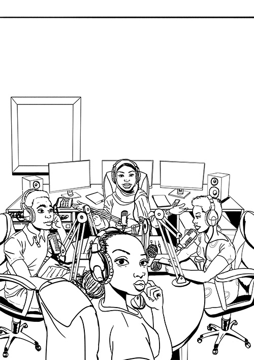
I start with a #4 sable brush, first painting the large black areas along with the main outlines of the body and hands. This allows me to quickly establish the primary light source and balance the black spaces on the page while also providing a sense of progress as a significant portion of the drawing gets filled in early.
I usually begin at the bottom of the page and work my way up. However, when using a pen, I start from the top left to avoid smudging the ink. My approach isn’t rigid—I adapt it based on the artwork since every page is unique and requires a different inking technique.
For traditional inking, I prefer a crow quill over technical pens. Technical pens produce a uniform line width, often referred to as a "dead line" because it lacks variation and character. With a quill pen, I can naturally adjust line thickness without switching tools or retracing lines, giving the artwork more depth and expressiveness.
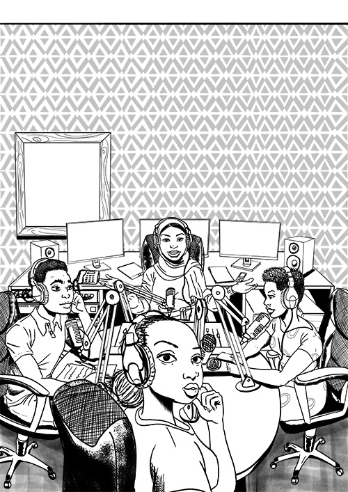
Now that all the large blacks and outlines are done. It’s time to concentrate even more on details and textures. Different smoothness and roughness. It’s up to an artist to try and replicate the textures using #102 brush.
That's for now, all kindly wait for the next tutorial on how to color comic page, Keep on Drawing!
Leave a Reply